在原網頁窗口高度根據內容自適應的基礎上,做了一些調整:
1、解決窗口底部靠近任務欄時,
window.resizeBy 不能調整窗口高度問題;
1、增加寬度自適功能(注:只針對寬度不足,進行擴展的情況;無法調整窗口寬度比實際內容寬的情況)
Ext.util.ResizeWin = function() {
try {
var sh = document.documentElement.scrollHeight
|| document.body.scrollHeight;
var ch = document.documentElement.clientHeight
|| document.body.clientHeight;
var sw = document.documentElement.scrollWidth
|| document.body.scrollWidth
var cw = document.documentElement.clientWidth
|| document.body.scrollWidth;
var xHeight = 55;//任務欄高度(double).
var statHeigth = 30;//狀態欄高度
var maxHeight = window.screen.height - xHeight; //最大可顯示網頁高度
var wHeight = window.screenTop + sh + statHeigth;
if(wHeight > maxHeight){
//窗口位置過底時,向上移動若干象素,使窗口狀態欄在任務欄上面.
var newTop = (window.screenTop - xHeight) + (maxHeight - wHeight);
if(newTop < 0) newTop = 0;
window.moveTo(window.screenLeft, newTop);
}
//寬度調整時,實際內容不夠寬可以適用,過寬無法調整.
window.resizeBy((sw-cw),(sh-ch));
}catch (e){}
};
以下從網上收集的一些相關資料:
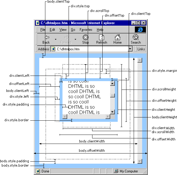
1、關于網頁窗口高、寬示意圖:
2、更多屬性:
網頁可見區域寬:document.body.clientWidth
網頁可見區域高:document.body.clientHeight
網頁可見區域寬:document.body.offsetWidth (包括邊線的寬)
網頁可見區域高:document.body.offsetHeight (包括邊線的寬)
網頁正文全文寬:document.body.scrollWidth
網頁正文全文高:document.body.scrollHeight
網頁被卷去的高:document.body.scrollTop
網頁被卷去的左:document.body.scrollLeft
網頁正文部分上:window.screenTop
網頁正文部分左:window.screenLeft
屏幕分辨率的高:window.screen.height
屏幕分辨率的寬:window.screen.width
屏幕可用工作區高度:window.screen.availHeight
屏幕可用工作區寬度:window.screen.availWidth
HTML精確定位:scrollLeft,scrollWidth,clientWidth,offsetWidth
scrollHeight: 獲取對象的滾動高度。
scrollLeft:設置或獲取位于對象左邊界和窗口中目前可見內容的最左端之間的距離
scrollTop:設置或獲取位于對象最頂端和窗口中可見內容的最頂端之間的距離
scrollWidth:獲取對象的滾動寬度
offsetHeight:獲取對象相對于版面或由父坐標 offsetParent 屬性指定的父坐標的高度
offsetLeft:獲取對象相對于版面或由 offsetParent 屬性指定的父坐標的計算左側位置
offsetTop:獲取對象相對于版面或由 offsetTop 屬性指定的父坐標的計算頂端位置
event.clientX 相對文檔的水平座標
event.clientY 相對文檔的垂直座標
event.offsetX 相對容器的水平坐標
event.offsetY 相對容器的垂直坐標
document.documentElement.scrollTop 垂直方向滾動的值
event.clientX+document.documentElement.scrollTop 相對文檔的水平座標+垂直方向滾動的量
IE,FireFox 差異如下:
IE6.0、FF1.06+:
clientWidth = width + padding
clientHeight = height + padding
offsetWidth = width + padding + border
offsetHeight = height + padding + border
IE5.0/5.5:
clientWidth = width - border
clientHeight = height - border
offsetWidth = width
offsetHeight = height
(需要提一下:CSS中的margin屬性,與clientWidth、offsetWidth、clientHeight、offsetHeight均無關)
網頁可見區域寬: document.body.clientWidth
網頁可見區域高: document.body.clientHeight
網頁可見區域寬: document.body.offsetWidth (包括邊線的寬)
網頁可見區域高: document.body.offsetHeight (包括邊線的高)
網頁正文全文寬: document.body.scrollWidth
網頁正文全文高: document.body.scrollHeight
網頁被卷去的高: document.body.scrollTop
網頁被卷去的左: document.body.scrollLeft
網頁正文部分上: window.screenTop
網頁正文部分左: window.screenLeft
屏幕分辨率的高: window.screen.height
屏幕分辨率的寬: window.screen.width
屏幕可用工作區高度: window.screen.availHeight
屏幕可用工作區寬度: window.screen.availWidt
posted on 2009-09-05 18:15
josson 閱讀(444)
評論(0) 編輯 收藏 所屬分類:
web開發