1. ToolTipToolTip
控件用于顯示頁(yè)面元素的附加解釋信息.就像 html 中的某些元素的alt屬性
示例代碼如下:ToolTip 控件 示例:
 <Grid x:Name="LayoutRoot" HorizontalAlignment="Left" VerticalAlignment="Center" Margin="20,0,20,0" Width="300" Height="180">
<Grid.RowDefinitions>
<RowDefinition MinHeight="30"></RowDefinition>
<RowDefinition MinHeight="30"></RowDefinition>
<RowDefinition MinHeight="30"></RowDefinition>
<RowDefinition MinHeight="30"></RowDefinition>
</Grid.RowDefinitions>
<Grid.ColumnDefinitions>
<ColumnDefinition></ColumnDefinition>
<ColumnDefinition></ColumnDefinition>
</Grid.ColumnDefinitions>
<TextBlock Height="14" Grid.Row="0" Grid.Column="0">用戶名:</TextBlock>
<TextBlock Height="14" Grid.Row="1" Grid.Column="0">用戶密碼:</TextBlock>
<TextBlock Height="14" Grid.Row="3" Grid.Column="0">密匙:</TextBlock>
<TextBox Width="120" Height="24" Grid.Row="0" Grid.Column="1" ToolTipService.ToolTip="注意區(qū)分大小寫(xiě)"></TextBox>
<PasswordBox Width="120" Height="24" Grid.Row="1" Grid.Column="1"></PasswordBox>
<Button Click="Button_Click" Width="120" Height="24" Grid.Row="2" Grid.Column="1" Content="獲取密匙" ToolTipService.ToolTip="單擊按鈕將獲取有效地開(kāi)發(fā)授權(quán)密匙">
</Button>
</Grid>
以上是一個(gè)獲取數(shù)據(jù)訪問(wèn)密匙的頁(yè)面片段, 其中紅字部分就是 ToolTip 控件的聲明和使用, 當(dāng)然你也可以用下面這種方式為按鈕聲明 ToolTip 提示控件, 其效果是一樣的<Button Click="Button_Click" Width="120" Height="24" Grid.Row="2" Grid.Column="1" Content="獲取密匙">
<ToolTipService.ToolTip>
<ToolTip Content="單擊按鈕將獲取有效地開(kāi)發(fā)授權(quán)密匙"></ToolTip>
</ToolTipService.ToolTip>
</Button>
效果圖如下:

看了以上代碼會(huì)發(fā)現(xiàn)都是從 ToolTipService 這個(gè)ToolTip的管理類(lèi)來(lái)獲取ToolTip對(duì)象, 而ToolTipService 類(lèi) 還有兩個(gè)附加項(xiàng)屬性: Placement (ToolTip顯示位置) 和 PlacementTarget (ToolTip依照該屬性指定的元素進(jìn)行定位) , 當(dāng)使用代碼為大量元素綁定 ToolTip 時(shí)很有用
2. Popup
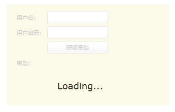
Popup 對(duì)象的作用是在現(xiàn)有Silverlight內(nèi)容之上顯示Popup.Child屬性中指定的內(nèi)容。繼續(xù)上例,當(dāng)點(diǎn)擊按鈕時(shí)為提交過(guò)程模擬一個(gè)Loading效果, 當(dāng)然這個(gè)Loading你等到天荒地老也不會(huì)完成的,該Loading效果的按鈕事件代碼如下ToolTip 對(duì)象
示例:
using System.Windows.Controls.Primitives;
 ..
..
private void Button_Click(object sender, RoutedEventArgs e)

 {
{
 //創(chuàng)建文本
TextBlock textblock = new TextBlock();
textblock.Text = "Loading";
textblock.Width = 120;
textblock.Height = 24;
textblock.FontSize = 18;
//創(chuàng)建遮蔽
Grid grid = new Grid();
SolidColorBrush brushcolor = new SolidColorBrush();
brushcolor.Color = Colors.White;
grid.Background = brushcolor;
grid.Opacity = 0.8;
grid.Width = Application.Current.Host.Content.ActualWidth;
grid.Height = Application.Current.Host.Content.ActualWidth;
grid.Children.Add(textblock);
//創(chuàng)建Popup
Popup p = new Popup();
//為Popup指定內(nèi)容
p.Child = grid;
//顯示Popup
p.IsOpen = true;
 }
}
運(yùn)行后效果如下:
 3. ChildWindow
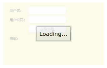
提供可在父窗口之上顯示的一個(gè)窗口并且阻止與父窗口的交互, 實(shí)際上就是一個(gè)增強(qiáng)版的 Popup , 多了一個(gè)如上例中Loading那樣的遮蔽層,我們將上例中的Loading效果,改為使用 ChildWindow 實(shí)現(xiàn)代碼如下:ChildWindow 對(duì)象
示例:
private void Button_Click(object sender, RoutedEventArgs e)
{
SolidColorBrush brushcolor = new SolidColorBrush();
brushcolor.Color = Colors.White;
ChildWindow cw = new ChildWindow();
cw.HasCloseButton = false;
cw.FontSize = 18;
cw.Opacity = 0.8;
cw.OverlayBrush = brushcolor;
cw.Content = "Loading";
cw.Show();
}
運(yùn)行后效果如下:
實(shí)際上 ChildWindow 對(duì)象 還可以包含一個(gè)標(biāo)題欄和一個(gè)關(guān)閉按鈕, 只不過(guò)loading不需要, 我們禁用了而已
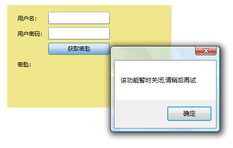
4. MessageBox
MessageBox為使用 js 中的模態(tài)窗口來(lái)顯示信息, 還是以上例進(jìn)行擴(kuò)展, 比如該功能暫時(shí)關(guān)閉時(shí),可以如下方式顯示:MessageBox 對(duì)象
示例
private void Button_Click(object sender, RoutedEventArgs e)
{
MessageBox.Show("該功能暫時(shí)關(guān)閉,請(qǐng)稍后再試");
}
運(yùn)行后效果如下: