JCombobox是Swing中比較常用的控件,它顯示一個項列表,擴展的是ListModel接口的模型,它的顯示繪制器通過實現(xiàn)ListCellBenderer接口來繪制列表單元,下面介紹 ①普通應用例子;②顯示圖片選項框例子;③修改下拉按鈕的例子;④下拉框可選與否的例子.
①
對于普通情況下使用JCombobox,沒有什么注意事項,只需要把JCombobox new出來,設置它的Model的值就可以了.
先看Sun給的官方的例子:
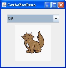
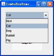
具體的實現(xiàn)很簡單:
String[] petStrings = { "Bird", "Cat", "Dog", "Rabbit", "Pig" };
//Create the combo box, select the item at index 4.
JComboBox petList = new
JComboBox(petStrings);
petList.setSelectedIndex(4);
petList.addActionListener(this);
也可以通過petList.setEditable(true);設置是否可以編輯.對于Action的處理和普通的一樣.
②
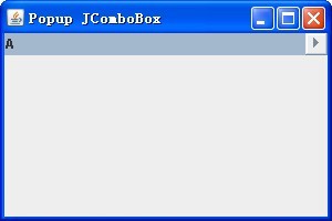
JCombobox默認下拉顯示和顯示項是文本,為了顯示其它內容比如圖片或者更復雜的東西,則需要設置新的Renderer,JCombobox的Renderer需要實現(xiàn)ListCellRenderer接口.
這個也比較簡單,Sun官方也給了例子:
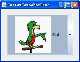
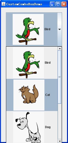
具體的實現(xiàn)其實和普通的一樣,先把JCombobox
new出來,在使用setRenderer方法設置自己定義的Renderer就可以了.
// Create the combo box.
JComboBox petList = new JComboBox(intArray);
ComboBoxRenderer renderer = new ComboBoxRenderer();
renderer.setPreferredSize(new Dimension(200, 130));
petList.setRenderer(renderer);
當然這個Renderer是實現(xiàn)了ListCellRenderer接口的.
privateclass ComboBoxRenderer extends JLabel implements ListCellRenderer {
這樣要是實現(xiàn)接口的方法:
/*
* This method finds the image and text corresponding to the
selected
* value and returns the label, set up to display the text and
image.
*/
@Override
public Component
getListCellRendererComponent(JList list, Object value, int index, boolean isSelected, boolean cellHasFocus) {
然后然后this就是繼承的JLabel了,對它可以設置屬性了:
setIcon(icon);
setText(pet);
最后把設置好的控件返回就可以了,
returnthis;
當然你也可以設置更復雜的控件,比如繼承JButton可以設置成按鈕的樣式.
③
Swing的MVC模式非常的好,當你需要更改控件的顯示的時候只需要繼承控件的基本UI,重寫你需要重寫的部位就可以了,這兒想下拉框的按鈕不顯示向下的箭頭,只需要繼承BasicComboBoxUI,重寫createArrowButton方法就可以了.
重寫UI
privatestaticclass MyComboBoxUI extends BasicComboBoxUI {
publicstatic ComponentUI createUI(JComponent c) {
returnnew MyComboBoxUI();
}
@Override
protected JButton createArrowButton() {
JButton button = new BasicArrowButton(BasicArrowButton.EAST);
return button;
}
}
當你需要修改JCombobox的UI的時候,只需要調用setUI方法就可以了.
JComboBox comboBox = new JComboBox(labels);
comboBox.setUI((ComboBoxUI)
MyComboBoxUI.createUI(comboBox));
④
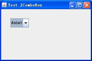
對于修改JCombobox的顯示可以從兩個方向考慮,一個是修改MetalComboBoxUI,一個是繼承ListCellRenderer.在通過設置UI和Renderer使界面修改.
先看完成后的界面:
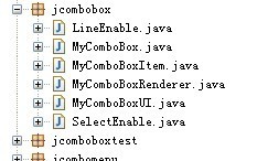
工程的目錄結構如下:
先設置JCombobox下拉框是否有線,為了使以后擴展容易,設置為接口:
/**
*theinterfacethattheJComboBoxcanhavelineenable.
*/
publicinterface LineEnable {
/**
*setbean.
*@paramisLineEnable
*
isLineenable
*/
publicvoid setLineEnabled(boolean isLineEnable);
/**
*getbean.
*@returnisLineenable
*/
publicboolean isLineEnabled();
}
同樣的對于JCombobox下拉框是否可以選擇也設置為接口:
/**
*theinterfacethattheJComboBoxcanselectenable.
*/
publicinterface SelectEnable {
/**
*setbean.
*@paramisSelectEnable
*
isSelectenable
*/
publicvoid setSelectEnabled(boolean isSelectEnable);
/**
*getbean.
*@returnisSelectenable
*/
publicboolean isSelectEnabled();
}
當然需要別的屬性,比如顏色、形狀等也可以再設置相同的接口.
對于JCombobox的沒一個Item,都可以通過實現(xiàn)這些接口獲得相應的顯示:
/**
*theitemsthatyouwanttoshowinJComboBox.
*/
publicclass MyComboBoxItem
implements SelectEnable, LineEnable {
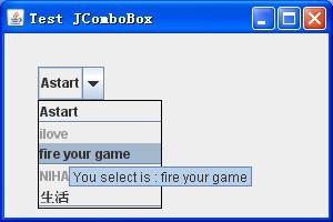
對于特殊的JCombobox設置Item時,設置MyComboBoxItem就可以使Item具有選擇可否和是否是線的樣式.
它具有3個屬性:
/**
*JComboBoxitems.
*/
private Object comboxItem = null;
/**
*isselectenabled.
*/
booleanisSelectEnabled = true;
/**
*islineenabled.
*/
booleanisLineEnabled = false;
可以通過設置它們得到JCombobox樣式,這個類就是一個簡單的Java Bean.
然后就是設置JCombobox的選項的顯示,實現(xiàn)ListCellRenderer接口,通過對組件的重寫設置描繪它的新屬性:
/**
*JComboBoxcellrenderer.
*/
publicclass MyComboBoxRenderer extends JLabel implements ListCellRenderer, ActionListener
{
重寫它的方法:
/**
*Returnacomponentthathasbeenconfiguredtodisplaythespecified
*value.
*/
@Override
public Component
getListCellRendererComponent(JList list, Object value, int index, boolean isSelected, boolean cellHasFocus) {
先設置它的顯示
String item = (value == null) ? "" : value.toString();
再設置是否是線:
if (((LineEnable) value).isLineEnabled()) {
returnnew JSeparator(JSeparator.HORIZONTAL);
}
接著設置tooltip,提示是否可以顯示:
if (-1 < index) {
if (((SelectEnable) value).isSelectEnabled()) {
list.setToolTipText("You select is : " + item);
} else {
list.setToolTipText("You cn't select : " + item
+ ", It
select unEnable.");
}
}
最后設置是否可以顯示:
if (!((SelectEnable)
value).isSelectEnabled()) {
setBackground(list.getBackground()); setForeground(UIManager.getColor("Label.disabledForeground"));
}
然后還是需要設置某些選擇不可選時候的設置不可選:
/**
*Thelistenerinterfaceforreceivingactionevents.
*/
publicvoid actionPerformed(ActionEvent e) {
Object tempItem = combox.getSelectedItem();
當是線的Item不可選,返回之前選項
if (((LineEnable) tempItem).isLineEnabled()) {
combox.setSelectedItem(currentItem);
} else {
currentItem = tempItem;
}
當是不可選的Item不可選,返回之前選項
if (!((SelectEnable) tempItem).isSelectEnabled()) {
combox.setSelectedItem(currentItem);
} else {
currentItem = tempItem;
}
}
接下來的類就是設置JCombobox的UI了,
/**
*MetalUIforJComboBox.
*/
publicclass MyComboBoxUI extends MetalComboBoxUI {
這里的UI設置主要是設置選擇不可選的項時清除,并對JCombobox的下拉的菜單設置
/**
*showthepopupmenusize.
*/
@Override
publicvoid show() {
Dimension popupSize = ((MyComboBox) comboBox).getPopupSize();
// reset size.
popupSize.setSize(popupSize.width,
getPopupHeightForRowCount(comboBox.getMaximumRowCount()));
Rectangle popupBounds = computePopupBounds(0, comboBox
.getBounds().height, popupSize.width, popupSize.height);
// set max and mini size.
scroller.setMaximumSize(popupBounds.getSize());
scroller.setPreferredSize(popupBounds.getSize());
scroller.setMinimumSize(popupBounds.getSize());
// Invalidates the container.
list.invalidate();
// set select.
int selectedIndex
= comboBox.getSelectedIndex();
if (selectedIndex
== -1) {
list.clearSelection();
} else {
list.setSelectedIndex(selectedIndex);
}
list.ensureIndexIsVisible(list.getSelectedIndex());
setLightWeightPopupEnabled(comboBox.isLightWeightPopupEnabled());
// show it.
show(comboBox, popupBounds.x, popupBounds.y);
}
然后在UI的new BasicComboPopup(comboBox) {
popup.getAccessibleContext().setAccessibleParent(comboBox);
就可以了.
最后的類就是自己的MyComboBox了,這個類其實也可以不要,只需要你在新建自己特殊的JCombobox時,不要忘記設置UI和傳入的Item是MyComboBoxItem就可以了,這里為了方便自己實現(xiàn)了,以后使用時只需要New MyComboBox就可以了.
/**
*theJComboBoxthatithavesomeownmethod.
*/
publicclass MyComboBox
extends JComboBox {
在構造函數(shù)里設置UI:
setUI(new MyComboBoxUI());
另外為了顯示寬度合適,它提供了設置popupWidth的方法:
public Dimension getPopupSize() {
Dimension size = getSize();
// reset size.
if (popupWidth < 1) {
popupWidth = size.width;
}
returnnew Dimension(popupWidth, size.height);
}
這樣一個屬于自己的JComboBox就設置完成了,使用方法如下:
MyComboBoxItem [] items = { new MyComboBoxItem("Astart"),
new MyComboBoxItem("BGold", true, true),
new MyComboBoxItem("ilove", false),
new MyComboBoxItem("fire
your game", true),
new MyComboBoxItem("", true, true),
new MyComboBoxItem("NIHA", false),
new MyComboBoxItem("生活"),
new MyComboBoxItem("", false, true) };
JComboBox jComboBox = new MyComboBox(items);
jComboBox.setRenderer(new MyComboBoxRenderer(jComboBox));
以后就可以當做一個普通的Java控件使用了.