extjs的語法很像java,對于這些組件的使用基本都是面向對象的。今天這部分內容,和swing 非常相似。
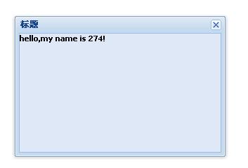
現亮一個window給大家看看:
<!
DOCTYPE HTML PUBLIC "-//W3C//DTD HTML 4.01//EN" "http://www.w3.org/TR/html4/strict.dtd"
>
<
html
>
<
head
>
<
meta
http-equiv
="Content-Type"
content
="text/html; charset=UTF-8"
/>
<
link
rel
="stylesheet"
type
="text/css"
href
="ext/resources/css/ext-all.css"
>
<
script
type
="text/javascript"
src
="ext/ext-base.js"
></
script
>
<
script
type
="text/javascript"
src
="ext/ext-all.js"
></
script
>
<
title
>
學習ExtJS之Panel
</
title
>
<
script
type
="text/javascript"
>
Ext.onReady(
function
()
{
var
win
=
new
Ext.Window(
{
title:
"
標題
"
,
width:
300
,
height:
200
,
html:'
<
h1
>
hello,my name is
274
!</
h1
>
'
});
win.show();
});
</
script
>
</
head
>
<
body
>
</
body
>
</
html
>
對于這種var win = new Ext.Window()方式創建對象是不是感覺很親切?

看看就這么2行代碼產生的效果吧:

漂亮并不需要寫多少代碼。其實這里還有很多可以添加的效果,比如常見的:
plain:true,(默認不是)
resizable:false,(是否可以改變大小,默認可以)
maximizable:true,(是否增加最大化,默認沒有)
draggable:false,(是否可以拖動,默認可以)
minimizable:true,(是否增加最小化,默認無)
closable:false,(是否顯示關閉,默認有關閉)
//幾個前面沒有介紹的參數
1.closeAction:枚舉值為:close(默認值),當點擊關閉后,關閉window窗口 hide,關閉后,只是hidden窗口
3.constrain:true則強制此window控制在viewport,默認為false
4.modal:true為模式窗口,后面的內容都不能操作,默認為false
5.plain://true則主體背景透明,false則主體有小差別的背景色,默認為false
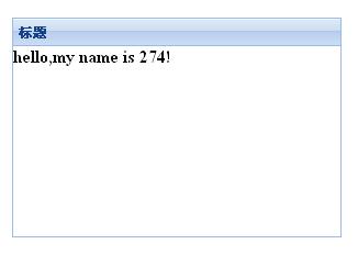
而pannel 和window是差不多的,比如構造參數我都可以直接通用:
<!DOCTYPE HTML PUBLIC "-//W3C//DTD HTML 4.01//EN" "http://www.w3.org/TR/html4/strict.dtd">
<html>
<head>
<meta http-equiv="Content-Type" content="text/html; charset=UTF-8" />
<link rel="stylesheet" type="text/css" href="ext/resources/css/ext-all.css">
<script type="text/javascript" src="ext/ext-base.js"></script>
<script type="text/javascript" src="ext/ext-all.js"></script>
<title>學習ExtJS之Panel</title>
<script type="text/javascript">
Ext.onReady(function()
{
var panel = new Ext.Panel(
{
title:"標題",
width:300,
height:200,
html:'<h1>hello,my name is 274!</h1>'
});
//win.show();
panel.render("hello");
});
</script>
<style>
body
{
padding:40px;
}
</style>
</head>
<body>
<div id="hello">
</div>
</body>
</html>
和上面對比的話只是顯示函數不同,而panel是將顯示的面板放到了一個div里(這么說有一點不妥),或者說參數傳了個div的id 。其實也可以直接在參數中加上renderTo:"hello" ,而避免再另外調用render函數。
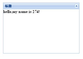
要想面板能收攏,加上collapsible 屬性就好了。如下面代碼。
Ext.onReady(function()
{
var panel = new Ext.Panel(
{
title:"標題",
width:300,
height:200,
html:'<h1>hello,my name is 274!</h1>',
collapsible:true,
renderTo:"hello"
});
});
對應效果:
一些常見配置參數:
1.autoLoad:有效的url字符串,把那個url中的body中的數據加載顯示,但是可能沒有樣式和js控制,只是html數據
2.autoScroll:設為true則內容溢出的時候產生滾動條,默認為false
3.autoShow:設為true顯示設為"x-hidden"的元素,很有必要,默認為false
4.bbar:底部條,顯示在主體內,//代碼:bbar:[{text:'底部工具欄bottomToolbar'}],
5.tbar:頂部條,顯示在主體內,//代碼:tbar:[{text:'頂部工具欄topToolbar'}],
6.buttons:按鈕集合,自動添加到footer中(footer參數,顯示在主體外)//代碼:buttons:[{text:"按鈕位于footer"}]
7.buttonAlign:footer中按鈕的位置,枚舉值為:"left","right","center",默認為right
8.collapsible:設為true,顯示右上角的收縮按鈕,默認為false
9.draggable:true則可拖動,但需要你提供操作過程,默認為false
10.html:主體的內容
11.id:id值,通過id可以找到這個組件,建議一般加上這個id值
12.width:寬度
13.height:高度
13.title:標題
14.titleCollapse:設為true,則點擊標題欄的任何地方都能收縮,默認為false.
15.applyTo:(id)呈現在哪個html元素里面
16.contentEl:(id)呈現在哪個html元素里面,把el內的內容呈現
17.renderTo:(id)呈現在哪個html元素里面
eg:
Ext.onReady(function()
{
var panel = new Ext.Panel(
{
title:"標題",
width:300,
height:200,
//frame:true,//圓角
plain:true,//方角 默認
collapsible:true,
tbar:[{text:"按鈕1",handler:function(){Ext.MessageBox.alert("我是按鈕1","我是通過按鈕1激發出來的彈出框!")}},{text:"按鈕2"}], //頂部工具欄
bbar:[{text:"按鈕3"},{text:"按鈕4"}], //底部工具欄
html:'<h1>hello,my name is 274!</h1>',
buttons:[{text:"按鈕5"},{text:"按鈕6"}], //footer部工具欄
buttonAlign:"left"
});
//win.show();
panel.render("hello");
});
Tabpanel 使用:
<!DOCTYPE HTML PUBLIC "-//W3C//DTD HTML 4.01//EN" "http://www.w3.org/TR/html4/strict.dtd">
<html>
<head>
<meta http-equiv="Content-Type" content="text/html; charset=UTF-8" />
<link rel="stylesheet" type="text/css" href="ext/resources/css/ext-all.css">
<script type="text/javascript" src="ext/ext-base.js"></script>
<script type="text/javascript" src="ext/ext-all.js"></script>
<title>學習ExtJS之Panel</title>
<script type="text/javascript">
Ext.onReady(function()
{
var tabs = new Ext.TabPanel({
renderTo: 'hello',
width:450,
//height:200,
activeTab: 0,
frame:true,
defaults:{autoHeight: true},
items:[
{contentEl:'script', title: '子面板1'},
{contentEl:'markup', title: '子面板2'}
]
});
var tabs2 = new Ext.TabPanel({
renderTo: document.body,
activeTab: 0,
width:600,
height:250,
plain:true,
defaults:{autoScroll: true},
items:[{
title: 'Normal Tab',
html: "My content was added during construction."
},{
title: 'Ajax Tab 1',
autoLoad:'ajax1.htm'
},{
title: 'Ajax Tab 2',
autoLoad: {url: 'ajax2.htm', params: 'foo=bar&wtf=1'}
},{
title: 'Event Tab',
listeners: {activate: handleActivate},
html: "I am tab 4's content. I also have an event listener attached."
},{
title: 'Disabled Tab',
disabled:true,
html: "Can't see me cause I'm disabled"
}
]
});
function handleActivate(tab)
{
alert(tab.title + ' was activated.');
}
});
</script>
</head>
<body style="padding:10px;">
<div id="hello">
</div>
<div id="script" class="x-hide-display">
<p>Lorem ipsum dolor sit amet, consectetuer adipiscing elit. Sed metus nibh, sodales a, porta at, vulputate eget, dui. Pellentesque ut nisl. Maecenas tortor turpis, interdum non, sodales non, iaculis ac, lacus.<br/><br/> Vestibulum auctor, tortor quis iaculis malesuada, libero lectus bibendum purus, sit amet tincidunt quam turpis vel lacus. In pellentesque nisl non sem. Suspendisse nunc sem, pretium eget, cursus a, fringilla vel, urna.</p>
</div>
<div id="markup" class="x-hide-display">
<p>Lorem ipsum dolor sit amet, consectetuer adipiscing elit. Sed metus nibh, sodales a, porta at, vulputate eget, dui. Pellentesque ut nisl. Maecenas tortor turpis, interdum non, sodales non, iaculis ac, lacus. Vestibulum auctor, tortor quis iaculis malesuada, libero lectus bibendum purus, sit amet tincidunt quam turpis vel lacus. In pellentesque nisl non sem. Suspendisse nunc sem, pretium eget, cursus a, fringilla vel, urna.<br/><br/>Aliquam commodo ullamcorper erat. Nullam vel justo in neque porttitor laoreet. Aenean lacus dui, consequat eu, adipiscing eget, nonummy non, nisi. Morbi nunc est, dignissim non, ornare sed, luctus eu, massa. Vivamus eget quam. Vivamus tincidunt diam nec urna. Curabitur velit.</p>
</div>
<br>
</body>
</html>
對應的顯示效果:

注意上面代碼中使用了items 屬性,表示子面板組。內容可以用html 元素ID 。比如:
items:[
{contentEl:'script', title: 'Short Text'},
{contentEl:'markup', title: 'Long Text'}
]
這樣這兩個子面板的內容將是ID為sript 和markup 的元素內容。
也可以,以html屬性直接表示子面板的內容:
items:[
{html:'script', title: 'Short Text'},
{html:'markup', title: 'Long Text'}
]
語句解釋: defaults:{autoHeight: true}, 默認自適應高度。當然這里面還可以設置為: defaults:{autoScroll: true},如果設置為 defaults:{autoScroll: true},高度就最好指定了。
下面還有一個tab面板,其子面板更多了。
我們發現renderTo 不僅可以綁在div (id) 也可以綁定在:document.body。
而其中比較特別的有:
1.autoLoad: {url: 'ajax2.htm', params: 'foo=bar&wtf=1'}
指切換到這個頁面,內容顯示為動態加載的,比如這里用了一個ajax方式,url 發送目標,params是參數形式。
2.listeners: {activate: handleActivate},
當面板切換到這個頁面將觸發事件:handleActivate
3.disabled:true,
指這個頁面不能點擊。
對于: plain:true, frame:true,
前者是子面板標題處樣式,前者并無背景,后者有背景(看起來像個框架),請參看上圖二者效果差異。
而activeTab:0 是指,默認顯示(訪問)的是哪一個子面板。0是第一次,如果不指定該屬性,默認不顯示子面板內容,只有當用戶點擊子面板后才顯示。
posted on 2008-07-06 00:04
-274°C 閱讀(17775)
評論(3) 編輯 收藏 所屬分類:
web前端